What it does
plotHeatmap visualizes scores associated with genomic regions, for example ChIP enrichment values around the TSS of genes. Like plotProfile, it requires that computeMatrix was run first to calculate the values.
We have implemented a number of optional parameters to optimize the visual output and we encourage you to play around with the min/max values displayed in the heatmap as well as with the different coloring options.
TIP: If your data is rather sparse and the resulting heatmap is too black, change the "Missing data color" to white (via "Advanced options").
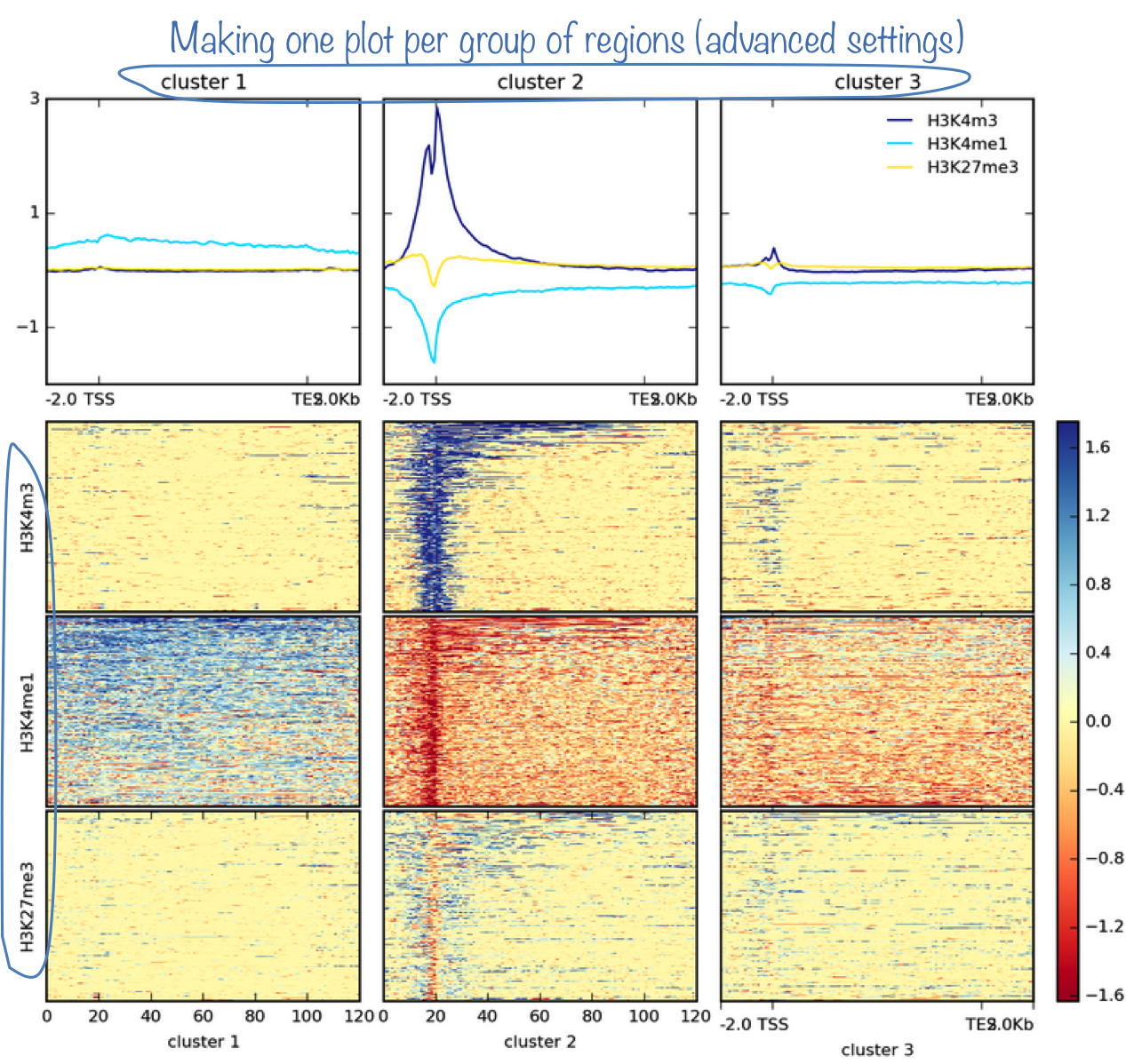
The most powerful option is probably the k-means/hierarchical clustering where you can sort your regions into groups of regions with similar score distributions.
NOTE: The clustering will only work if you supplied a single BED file to computeMatrix. plotHeatmap cannot cluster regions within pre-defined groups. Moreover, k-means will be much faster than hierarchical clustering.
Output
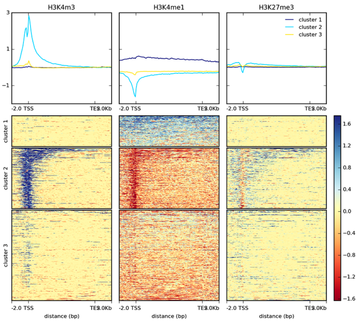
This is a heatmap based on two bigWig files generated with default settings and k-means clustering.
In addition to the image, plotHeatmap can also generate the values underlying both the heatmap.
See the following table for the optional output options:
| optional output type | computeMatrix | plotHeatmap | plotProfile |
| values underlying the heatmap | yes | yes | no |
| values underlying the profile | no | no | yes |
| sorted and/or filtered regions | yes | yes | yes |
More examples can be found in our Gallery.
For more information on the tools, please visit our help site.
For support or questions please post to Biostars. For bug reports and feature requests please open an issue on github.
This tool is developed by the Bioinformatics and Deep-Sequencing Unit at the Max Planck Institute for Immunobiology and Epigenetics.