Matrix correlation
hicCorrelate is a dedicated Quality Control tool that allows the correlation of multiple Hi-C matrices at once with either a heatmap or scatterplots output.
Computes pairwise correlations between Hi-C matrices data. The correlation is computed taking the values from each pair of matrices and discarding values that are zero in both matrices. Parameters that strongly affect correlations are bin size of the Hi-C matrices (can be changed using hicMergeMatrixBins) and the considered range. The smaller the bin size of the matrices, the finer the differences you score. The Range parameter should be selected at a meaningful genomic scale according to, for example, the mean size of the TADs in the organism you work with or to specific ranges found using hicPlotDistVsCounts.
Usage
It is recommended to use this tool on corrected matrices (hicCorrectMatrix) at restriction enzyme resolution (unmerged bins).
Output
hicCorrelate outputs correlation plots of multiple Hi-C matrices.
Below, you can find a correlation example of uncorrected Hi-C matrices obtained from Drosophila melanogaster embryos, either wild-type or having one gene knocked-down by RNAi.
Heatmap
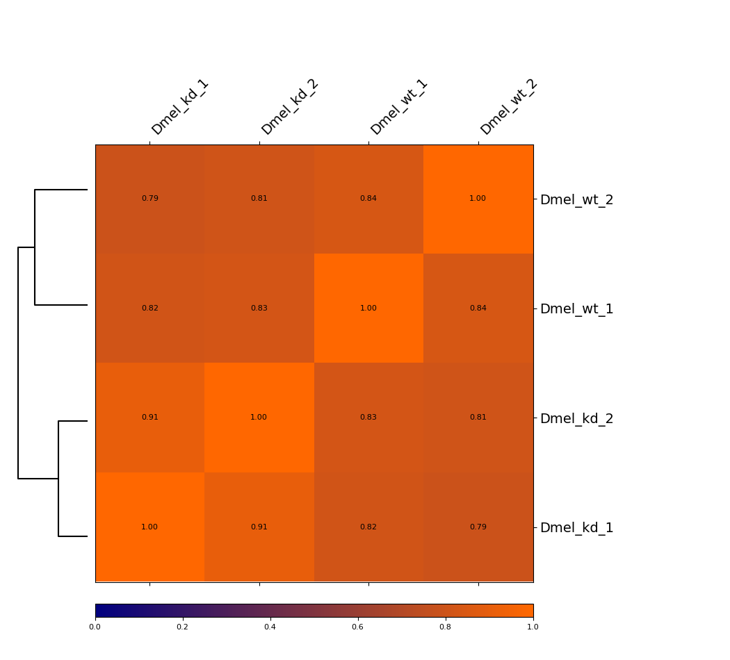
This example is showing a heatmap that was calculated using the Pearson correlation of corrected Hi-C matrices with a bin size of 6000 bp at a range of 5000 to 200000. The dendrogram indicates which samples are most similar to each other. You can see that the wild-type samples are seperated from the knock-down samples. In that case, Spearman correlation gives very similar results (not shown).
Scatterplot
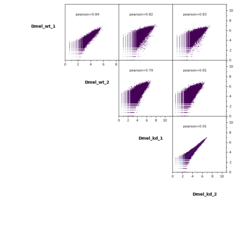
Additionally, pairwise scatterplots comparing interactions between each sample can be plotted.
For more information about HiCExplorer please consider our documentation on readthedocs.io.