What it does
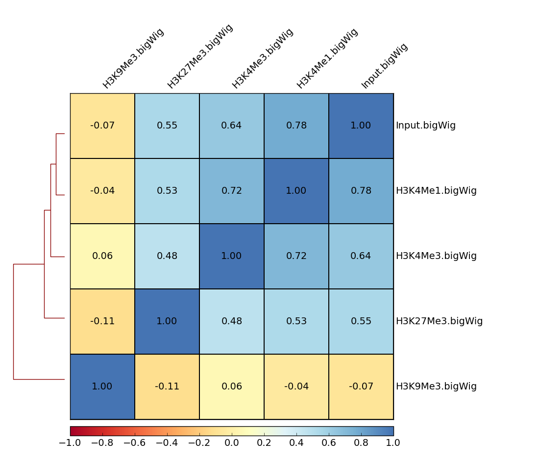
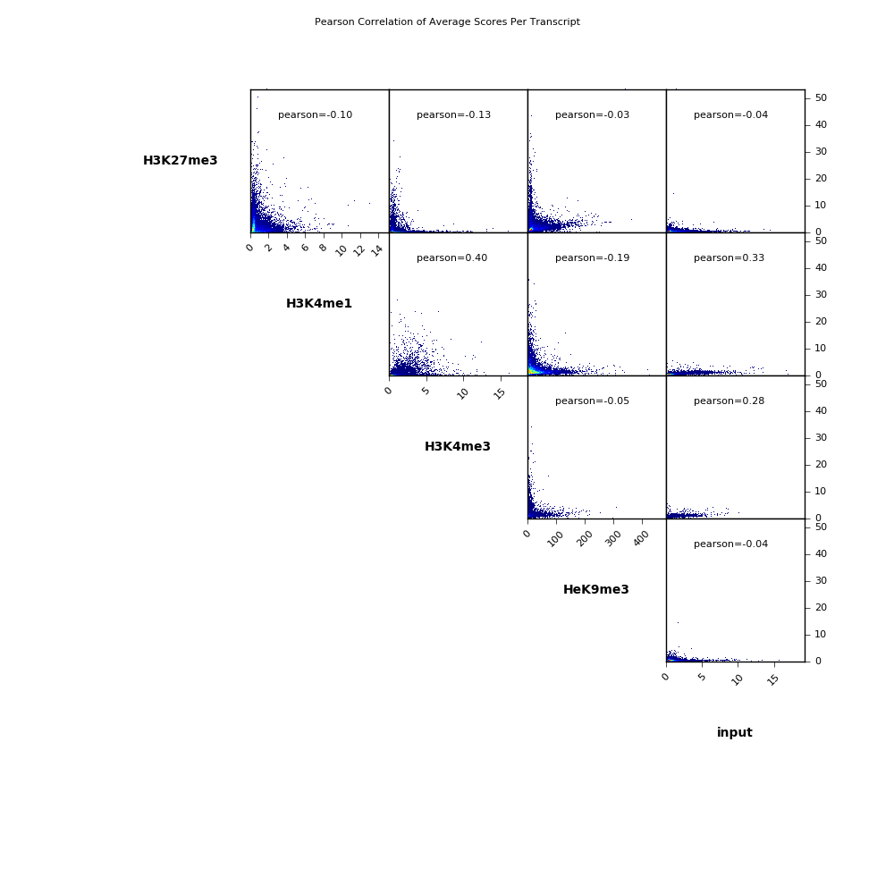
This tools takes the default output of multiBamSummary or multiBigwigSummary, and computes the pairwise correlation among samples. Results can be visualized as scatterplots or as a heatmap of correlation coefficients (see below for examples).
Theoretical Background
The result of the correlation computation is a table of correlation coefficients that indicates how "strong" the relationship between two samples is and it will consist of numbers between -1 and 1. (-1 indicates perfect anti-correlation, 1 perfect correlation.)
We offer two different functions for the correlation computation: Pearson or Spearman.
The Pearson method measures the metric differences between samples and is therefore influenced by outliers. The Spearman method is based on rankings.
Output
The default output is a diagnostic plot -- either a scatterplot or a clustered heatmap displaying the values for each pair-wise correlation (see below for example plots).
Optionally, you can also obtain a table of the pairwise correlation coefficients.
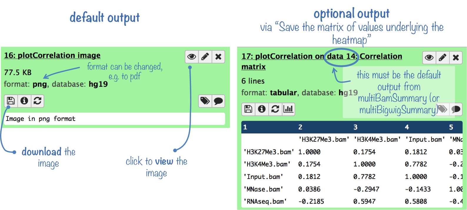
Example plots
The following is the output of plotCorrelation with our test ChIP-Seq datasets (to be found under "Shared Data" --> "Data Library").
Average coverages were computed over 10 kb bins for chromosome X, from bigWig files using multiBigwigSummary. This was then used with plotCorrelation to make a heatmap of Spearman correlation coefficients.
The scatterplot could look like this:
For more information on the tools, please visit our help site.
For support or questions please post to Biostars. For bug reports and feature requests please open an issue on github.
This tool is developed by the Bioinformatics and Deep-Sequencing Unit at the Max Planck Institute for Immunobiology and Epigenetics.