Summary
This function plots a visual summary of the distribution of quality scores as a function of sequence position for the input fastq datasets.
Details
The distribution of quality scores at each position is shown as a grey-scale heat map, with dark colors corresponding to higher frequency. The plotted lines show positional summary statistics: green is the mean, orange is the median, and the dashed orange lines are the 25th and 75th quantiles. If the sequences vary in length, a red line will be plotted showing the percentage of reads that extend to at least that position.
Overview
The intended use of the dada2 tools for paired sequencing data is shown in the following image.
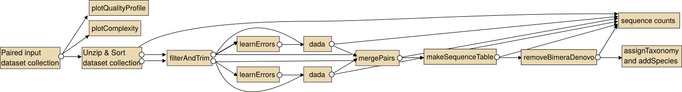
Note: In particular for the analysis of paired collections the collections should be sorted lexicographical before the analysis.
For single end data you the steps "Unzip collection" and "mergePairs" are not necessary.
More information may be found on the dada2 homepage:: https://benjjneb.github.io/dada2/index.html (in particular tutorials) or the documentation of dada2's R package https://bioconductor.org/packages/release/bioc/html/dada2.html (in particular the pdf which contains the full documentation of all parameters)